Valiant Gears
A downloadable game for Windows
Download NowName your own price
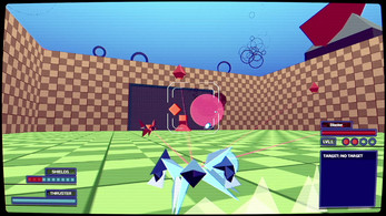
Alarms are going off, a new threat rains from the skies.
An alien AI is attacking the planet.
It's time for you, a Valiant Defense Team pilot to jump into the battle and fight your way to the mother-ship and save the day!
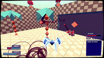
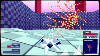
Fight hordes of enemy robots, dodge volley of bullets and deliver hell to your enemies in this old-school 3D shoot'em up!
| Status | In development |
| Platforms | Windows |
| Rating | Rated 5.0 out of 5 stars (1 total ratings) |
| Author | Gaze Interactive Dev |
| Genre | Shooter, Action |
| Tags | 3D, Arcade, Shoot 'Em Up |
| Links | Steam |
Download
Download NowName your own price
Click download now to get access to the following files:
Valiant Gears Demo V2 119 MB


Comments
Log in with itch.io to leave a comment.
DEMO V2:
All around a better experience. While some issues still remain, I find myself playing for longer. Some stuff that still annoys me:
-A lot of mechanics aren't fully understood until you get used to how they're set up (you get no bombs on respawn until you manually break a canister), so there needs to be a comfortable tutorial level.
-Dash shouldn't be exclusive to shift, you should also be able to double tap a direction. Dashing in mid air is super helpful, but also uncomfortable.
-Leveling up and down should be more obvious. When I see five balls next to the aim reticle, I don't know what that means. Have a plain obvious "LEVEL UP!" notification pop up near the player, and give a vertical level bar right next to shield. Dying also shouldn't take you to level zero, should just level down.
-The label regarding what item you just picked up should be larger. I didn't realize what I picked up was a shield charge until halfway through playing.
-All powerups should move towards you when nearby. This is huge. A lot of life or death scenarios ended in death because I was like 1 unit away from a power up, hopping around.
-Powerup canisters should break in much less hits. It's too risky to go for a powerup when it takes as long to break the canister as an enemy.
-There needs to be more checkpoints and levels should "know" their difficulty more, the escalation is a bit much still. The first zone still gives me so much trouble. Also levels should be shorter.
-There should be shield charges during a boss. The 1st boss should also have less health, way too difficult for a first level.
-The enemies that spawn out of the generator home into you too fast and too aggressively. During the boss this is a total pain.
-There seems to be a bug where if I die enough times, the game just freezes at checkpoint. Does it have something to do with me focusing out of the window for a bit?
A lot more fun than the previous demo, but I'm still whiny :p I can feel the input you took into account, and it's better because of it. Just a little more and I think you should go into full production.
The verticallity makes the game feel so much better, the hover is lovely.
I really enjoyed the gameplay and the visuals!
I'm missing some visual feedback when using the thruster while airborne.
Although looks natural, some people might get lost on how to use Bombs and what which powerup does by looking just for the letter. Suggestion: some tutorial for commands and maybe using the target window to preview how the bullet will look like and it`s strength would be nice.
It's a super fun game and I could play through the whole quarantine.
DEMO V1:
It's fun. However my main issues are readibility related.
The first level escalates in difficulty way too fast, and at a point the checkpoints are too harsh. It feels like handling some of these rooms is like just adapting to move in a way that throws the enemies off, rather than paying attention to the specific patterns. However, I do appreciate the room like design. I think it's a clever idea for this kind of game. More verticallity can keep things fresh between rooms.
There is no invincibility buffer, and I feel when making a 3D shmup you have to embrace the fact that readability will be one of your hardest to solve issues when you've got multiple patterns happening in 3D space. I don't think the solution is fixing readibility 100%. I think being generous regarding the chaos is a good way to tackle it. Gimme a counter, that if fails eats fuel, otherwise deflects the bullets fired at me. Gimme a hover or double jump. A lot of these patterns are vertical after all; *even a little* would help a ton. There are options I just can't do since the game is feeling cruel about it. I wanna grab a power up and make a winning move, but like 5 enemies are stationed right around it.
There isn't enough visual feedback when I level up or collect a powerup. A little notification would do.
I think the music is okay, but it's repetitive for the level's length.
Despite dumping a heap of critique, it was fun. Getting a power up and taking out a hoard you had trouble with was neat. Managing to successfully dodge a heap of bullets and begin picking up on what enemies I want to take out first felt a little strategic. Dashing around enemies feels fun. With gameplay polish, I think this could become console release tier. The visuals are simple, yet the combination of elements you put in feels unique. I can't find another game that plays or looks like this, so it's definitely a unique flavor of fun. And it's certainly worth keeping an eye on.